Recreating Final Fantasy 7
As a game dev trying (to some extent) to recreate the glories of gaming in the 1990’s with my platformer game Adventures of Chris, I have a really strong interest in the upcoming Final Fantasy 7 Remake. I loved the original game. I’ve played it multiple times as an adult, still finding enjoyment in it, despite the blocky and pixelated graphics. The thought of a remake with modern graphics and modern gaming mechanics is exciting for me.
However…
After viewing the gameplay footage and announcements at E3, I worry a bit. A lot of people seem concerned that the entire first game is set in Midgar.
While I share that concern to some extent, I actually really loved the Midgar portion of the original game. To some extent I can see why an entire game set in the corrupt city might seem a little… iffy.
For me, though, there’s another reason to be wary of Square Enix’s decision of setting the entire first game in Midgar. Based on what I’ve seen in trailers and demos so far, I’m not sure that the designers of the remake really get Midgar (or, at least, what made Midgar so appealing to me back in the day).
Let’s do a side-by-side comparison, shall we?
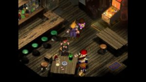
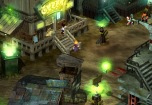
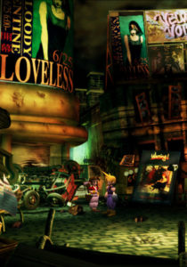
First off, here are a few screenshots from the original PlayStation 1 version:
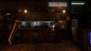
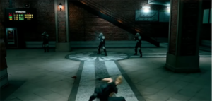
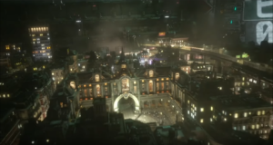
And now here are a few shots from the upcoming Final Fantasy 7 Remake:
Some Things Lost in Translation
The difference isn’t extreme, but it’s significant enough to worry me a bit.
The original FF7’s Midgar was more than just a dirty, industrial metropolis. It was nightmarish. Whether we’re talking about the slums below the plate, or the allegedly nicer city on top, every design element of Midgar communicated that something was wrong.
Colors were garish and highly contrasted – sickly greens next to neon oranges. Textures were exaggeratedly scarred, filthy, and pitted. Everything was covered in freakish graffiti and advertisements, suggesting a creepy Asian-influenced Times Square from the 1970’s.
Some of this was the result of intentional design decisions. Some of it, however, is just the product of the technology of the times.
The pixelation, the weird texturing, the cartoony quality – it all comes together to give Midgar a profoundly surreal vibe that is disturbing and strange. It’s both threatening and unreal, capturing a feeling like you’ve woken up from a bad dream. But in Midgar, you’re trapped in that feeling for hours.
Everything Midgar depicts communicates to the player that it shouldn’t be there. This reinforces the main theme and conflict of the game – Shinra’s exploitation of nature has a very visceral and intense impact.
(Spoiler alert) Therefore, when you find the city covered in green life at the end of the game, the world feels restored in a profound way. (/end spoilers)
A Modern Take on Final Fantasy 7
Now, take a look at the remake shots. While the images still convey similar feelings present in the original, in general the design feels a lot weaker. I’ve described it to people as feeling a little… “generic urban,” and I’ve gotten some nods in response.
One of my brothers remarked that it looks like “downtown Atlanta at night.” Now granted, downtown Atlanta is a little disturbing and strange, but a fair amount of the nightmarish quality of the original Midgar doesn’t appear to have made the transition.
Many of the areas such as the subway station or the city streets on top of the plated seemed… kind of nice! It’s in this modern urban setting where I find myself asking questions like:
Where are the creepy Japanese ads?
The graffiti?
The exaggerated filth laced with nauseating colors and weird angles?
Will Final Fantasy 7 Remake Capture Some Nostalgia?
Now it’s possible that once I’ve played the game, the general design and impact will strike me in a completely different way. It may work very well in the context of a full playthrough. I don’t want to prematurely write off the design. Regardless, I still worry…
Part of what made the 90’s so great for me was the way cartoony aesthetics were used in games. It allowed for flexibility and exaggeration which could create captivating environments. Colors and charm that typically provided reassurance could easily be used in contrast with others to create a surreal and creepy feel.
These elements were juxtaposed frequently during this period. It allowed charming characters to pull players through disturbing and captivating worlds. With the addition of uplifting and dark, emotionally heavy stories, games of this era were able to strike a chord with players; one that resonated with them and left a lasting impact. Of course, Final Fantasy VII was a prime example of this!
Adventures of Chris isn’t nearly as dark as FF7, but there are elements of darkness and emotion in there. There is little bit of “weight” underneath the brighter, friendlier, and more buoyant qualities of the game with the occasional (I hope) creepy or surreal design elements as well.
With any luck, it should capture just a little bit of that wonderful 90’s mix.
But man, the original Midgar was something awesome. What do you think?



Comments (1)
Comments are closed.